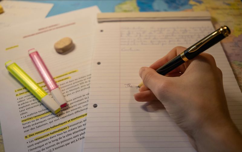
You finished writing a paper, and now you need to present it as a slideshow. Does this mean you need to start a new project from scratch?

The good news is that once the paper is already written, the hard part is done! Slideshows are a visual support for your content with graphics and minimal text.
These five steps will help you create an engaging slideshow presentation.
1. Identify the Main Points
A slideshow is usually shorter than a paper, as the slides leave out many details. The right length depends on the assignment.

Read the whole paper and identify the thesis statement and main points. The abstract, introduction, and conclusion summarize the main points, so use those sections as guides for what to cut.

Write the main points on sticky notes or in a word processor so you can organize them. A slideshow usually has a title slide, introduction and thesis, content, conclusion, and references.

Use the paper's headings as guidelines for your slide headings. Or think of a word or short phrase that describes the section you just read and use that as a slide heading.

Consider your audience's knowledge about the topic and what they must know to understand the main argument of the paper. Take out anything that isn't need-to-know.
2. Pull Out Key Words
It's fine to read the paper as a script, but don't copy every word onto the slides! Too much text is overwhelming to read and distracting. Your audience may feel annoyed if they're reading the slides while listening to you read the same content.
A text-heavy slide isn't very engaging.
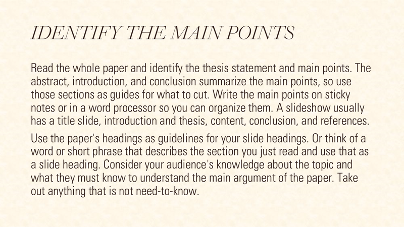 Image created by the author with PowerPoint. To hear an audio description of the image, click Play on the audio player below.
How Much Text?
Slideshow text is not like a formal summary but almost like a draft outline. Think keywords and short phrases, not sentences and paragraphs. You're taking a page or pages of text and reducing it to a few words or images on a slide. A guideline for text on a slide is the 6x6 rule: no more than six lines of text with six words per line.
This slide follows the 6x6 rule and has keywords bolded to draw the audience's attention.
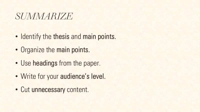 Image created by the author with PowerPoint. To hear an audio description of the image, click Play on the audio player below.
Did you know?
3. Visually Organize the Content
Besides regular sentences, there are many other ways to organize content. Images and graphs are a better use of the slideshow format than paragraphs of text.
Animations
Animations can reveal bullet points or sections as you talk and then hide them when the topic changes. Animations allow for a bit more text on a slide without the additional text being distracting.
 Image created by the author with PowerPoint.
Bullet Points
Use bullet points when you have a list. Avoid writing long sentences in the bullet points, which defeats the purpose of this type of layout. As a best practice, write all bullet points as fragments or complete sentences, not a mix of both.

Columns and Quadrants
Dividing your content into halves, thirds, or fourths (quadrants) is another effective way to break up text. This type of layout is effective for comparison charts.
A slide with more text, such as this one, could use an animation that reveals each section.
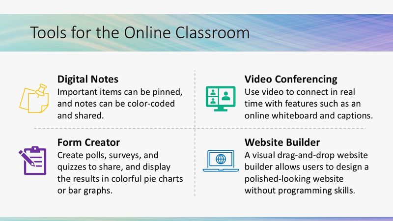 Image created by the author with PowerPoint. To hear an audio description of the image, click Play on the audio player below.
Icons
Icons are useful when the concept can be represented by a minimalist, stylized illustration.

Images and Videos
Relevant images and videos can enhance or replace text. Cite the author of any media that you use. To avoid a copyright issue when using media created by others, find media that is in the public domain or has a license that allows for free reuse.

Tables and Graphs
Use tables and graphs when making comparisons or visualizing data.

Did you know?
Subscribe for more quick bites of learning delivered to your inbox.
Unsubscribe anytime. No spam. 🙂
4. Make the Slides Readable
All visuals should enhance your content and not distract from your script.
Slideshow Visuals Checklist
Use subtle animations and transitions. Too much movement can be distracting.
Use dark font on a light background or vice versa, not dark on dark or light on light.
Choose 1-2 easily readable fonts (sans serif or serif are good choices) with a font size of at least 24pt. Oral presentations need an even larger font.
For a cohesive look, follow a color scheme, such as your school's colors.
Check the alignment between slides to make sure the text boxes are in the same places.

Visual Design: Before
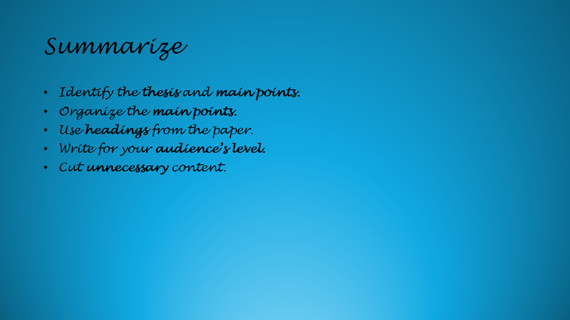 Image created by the author with PowerPoint.
This slide has minimal text, but the visual design makes it difficult to read:
Small font in a script style that could be harder to read
Low contrast because of the dark font on a dark background
Visual Design: After
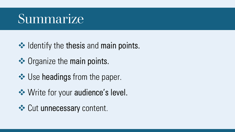 Image created by the author with PowerPoint.
This slide keeps the blue color scheme, and the content is much easier to read:
Large font in an easily readable serif (heading) and sans serif (bullet points)
Good contrast between the dark text and the light blue background and the white text against the dark blue heading
5. Proofread and Practice Presenting
Once your draft is finished, proofread the slides and double-check all citations and references for images and text.
Check the flow of the content by exporting the slides as a PDF and scanning through them. Content flow issues sometimes pop out when you read the slides as a group rather than as separate pieces.
Practice giving the presentation while moving through the slides to get a feel for the correct timing. Time yourself and cut material if necessary.
 Photo by airfocus on Unsplash
Slideshow Design Summary
Use minimal text.
Have your slide text and script text be different (except for short quotes).
Use adequate color contrast and a large font size to make the text readable.
Quiz
Hana is converting a paper into a slideshow presentation. What should she do to make the slides engaging?
Take Action

Your feedback matters to us.
This Byte helped me better understand the topic.

