
You're in the middle of creating a graphic. You’ve got a good idea of how you want it to look, but you’re stuck on one thing.
You don’t know what to choose for your fonts.
Your goal is to communicate an idea to an audience. Choosing a font can either give your design credibility, or it can turn your audience away.

Don’t worry though! There are questions to consider that will help you choose the right fonts.
What's Your Brand?
First, you have to consider your brand. What impression do you want to give off?
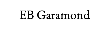 EB Garamond is a font to choose if you want elegant and refined.
 If you want whimsical, choose something similar to Bradley Hand.
 Choose Helvetica for a formal look.
 A family-oriented font could be Kristen.
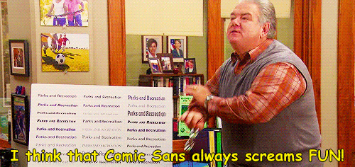
Some fonts already have negative perceptions. For example, Comic Sans, Papyrus, and Curlz are fonts you want to avoid if you're going for an elegant or formal look.
Is It Legible?
You want to be sure your audience can actually read your text. People will be confused or frustrated if they can’t understand what it says.

Avoid using uppercase fonts in large bodies of text. Save them for titles or headlines.
Choose a font that works in multiple sizes and screens.
Even though cursive is pretty, only use it as an accent. Cursive fonts are hard to read, especially on small screens.
Did you know?
Serif Vs. Sans-serif
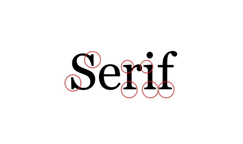 Serif fonts have little strokes on the letter. Serifs are generally easier to read for bodies of text. You may choose a serif font for print publications, such as magazines and newspapers.
Examples include Georgia, Lucida, and Times New Roman.

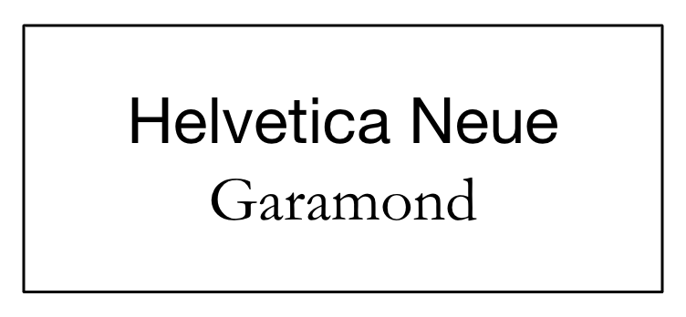
Sans-serif fonts don't have little strokes. Sans-serif fonts are easier to read on a digital screen.
Examples include Arial, Tahoma, and Verdana.
Quiz
Aaron is creating a website for his portfolio and wants to choose a font to describe his content. Which font would be the best option?
Subscribe for more quick bites of learning delivered to your inbox.
Unsubscribe anytime. No spam. 🙂
Creating A Hierarchy
When choosing fonts and the layout, it creates a hierarchy. A good layout will draw the reader’s eye to important information first.
Use no more than 2-3 fonts. Too many can fight for attention.
Avoid using fonts that are too similar.
Make sure they have substantial contrasting differences.
Combining a serif font with a sans serif font is a great way to contrast. Even changing the size and weight of the font would work.
Did you know?
Take Action
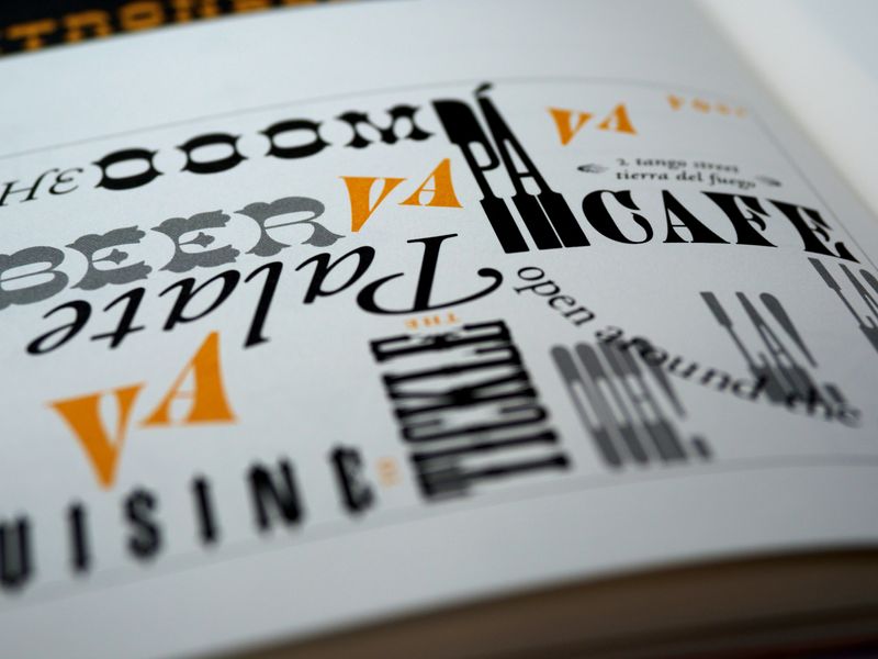 Photo by Brett Jordan on Unsplash
Choosing the right font can help make a good impression and get your point across. Remember these tips to help you!
Your feedback matters to us.
This Byte helped me better understand the topic.