Hey, I'm Dora Cruceru - Creative Director for Open Door Media. 🖖
Over my career, I've learned a lot about the most efficient ways of building websites and I found that by using a grid system you can pretty much handle and solve any complex design problems.

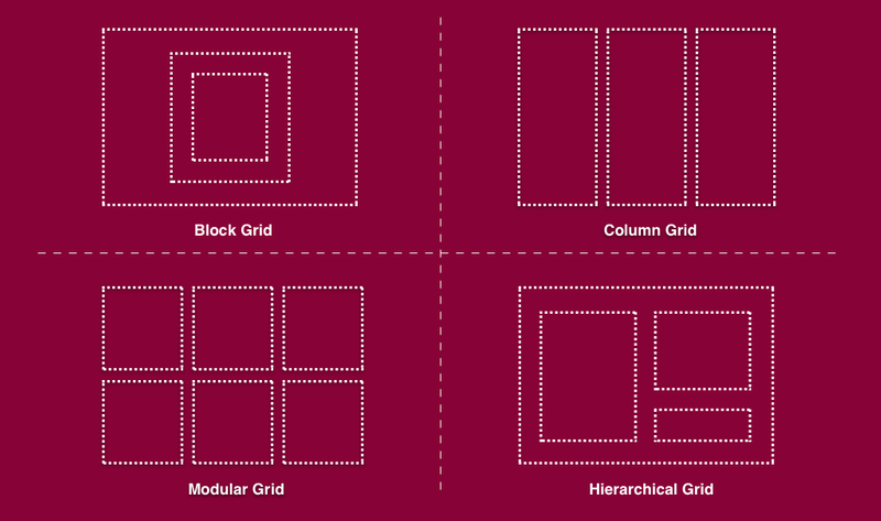
As rigid as the idea of a grid system seems, it is actually meant to enable you to design with greater speed and confidence. A grid system is a structure comprising a series of horizontal and vertical lines, used to arrange content. It provides an easy way for designers to structure and present content and images in an organized, manageable, and readable way.

PLEASE let me help you take a shortcut to success by avoiding falling into the trap of unprofessional website design.
The Issue
The most common issue I see in web design is misaligned, misplaced elements.
People are most likely to make these mistakes by not using a grid system. Especially when they are new in the web design world. Here's an example:

As you can see, the images, texts, and links don't follow a consistent grid. This affects user experience and design adoption, making people less likely to stay on your site or return in the future.

Quiz
What are the most common issues when not using a grid system?
Why People Fall Into The Trap
People fall into the trap of not using grid systems because they perceive them as rigid.
The whole purpose of the grid is so you can design with speed and confidence.
Following the grid when placing your elements can give you peace of mind that you are making design choices that will look clean and cohesive to users.

How To Sidestep It
"The use of a grid as an ordering system is the expression of a certain mental attitude inasmuch as it shows the designer conceives his work in terms that are constructive and oriented to the future."
At a high level: follow the grid! If you aren't sure, choose the simple option rather than a complex or busy design.
Learn some best practices from this 3 minute video:
Subscribe for more quick bites of learning delivered to your inbox.
Unsubscribe anytime. No spam. 🙂
Bonus Wisdom
Plan how the grid relates to its container
Don’t just design with a grid—design the grid
Always begin and end elements in a grid field—not in the gutter
Don’t forget about baseline alignment
For web and UI design, consider using a system like the 8px grid

Take Action
I believe in you! And with this extra bit of wisdom in your pocket, you're going to be unstoppable.
Keep your momentum going
Your feedback matters to us.
This Byte helped me better understand the topic.
.png?alt=media)