Sarah is passionate about the environment and climate change. To raise awareness, she created a website dedicated to this cause. Sarah soon learned that a logo would help her website look professional.

Sarah also loves graphic design and wants to create a logo for her website, but she is still figuring out how to start when it comes to logo design basics.
These 5 tips will help Sarah create an engaging logo that helps promote her cause!
Why are Logos Important?

Brand identity: helps show a company's mission and personality
Brand recognition: can help you stand out from competitors
Message: can help send a message to your target audience
Versatility: can be used across different mediums and platforms
1. Less is More!
When creating a logo, keep it simple. This is important because the simpler a logo is, the easier it will be for people to recognize it and create brand recognition.
A simple logo uses less color and is more adaptable, allowing you to use it across various mediums, such as print or digital media.
Here are some examples of simple logos that people easily recognize and are consistent with logo design basics:
 McDonald's
 Apple
Apple
 Target
 Instagram
2. Types of Logos
 Word Mark
Uses only typeface and color to create the logo
 Emblem
Consists of a symbol or icon that is surrounded by a seal or border
 Image Logo
Made of a symbol or graphic that is easily recognizable
Doesn't use any text
 Combination Mark
Combines typeface and logo
Has two elements that need to work together and can also be recognized apart
 Letter Mark
Very minimal text
Usually consists of a letter or symbol
3. Sketching Your Logo
 Photo by Timothy L Brock on Unsplash
The first step in designing your logo will be to sketch different ideas or concepts. Sketching also allows you to explore different shapes, typography, or imagery before committing to a final design. When sketching, remember to:
Research: Who is your target audience? Look at competitors to help you understand what your brand personality will be and give you inspiration.
Brainstorm: Consider the logo you want to represent the brand. For example, what kind of typography do you think you will be using?
Set your imagination free: Use whatever you need to sketch your idea. Explore as many different ideas or concepts as you want!
Refine: Once you like an idea, you can concentrate on refining those ideas and selecting the best elements from your sketches.
Get feedback: Once you determine your final design, get input from others to identify any areas of improvement or to make sure you are communicating the correct message.
4. Choosing Colors for Your Logo
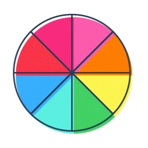 It's important to choose the right colors for your logo. Colors can convey emotions and make your logo more memorable.
Emotions that are typically associated with colors:
Orange: confidence, friendliness, energy
Red: excitement, passion, movement
Green: health, freshness, nature
Blue: trust, security, serenity
Purple: wealth, spirituality, sophistication
Pink: femininity, caring, imaginative
Black: sophistication, elegance, authority
White: cleanliness, innocence, simplistic
5. Choosing Typography for Your Logo
The font you select for your logo has to be chosen carefully, as this will reflect your brand's personality. There are so many fonts to choose from, so finding the perfect one can be difficult.
When choosing a font, consider readability. Fonts that are difficult to read can make a logo look unprofessional. Also, consider the size and spacing of the font so that it looks good in different mediums.
Types of typography include the following:
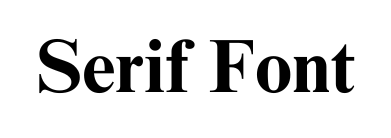
Has an anchor at the end of each letter
Times New Roman is an example of this type of font
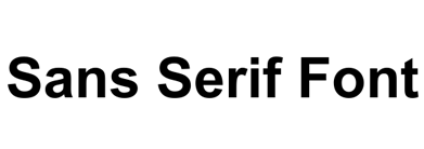
Doesn' t have any anchors and has a more modern look to it
A popular sans serif font is Arial
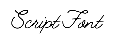
A curvy font style that is elegant and resembles cursive handwriting
Lobster and Allura are examples of popular script fonts
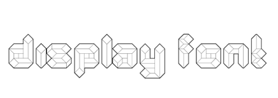
A fun font that is unique and comes in variations
A great example of this type of font is Quad Line
Quiz
Jose is designing a new logo for a children's toy company. Which type of font might work best?
Free Logo Creators
Practice what you've learned about logo design basics with these free tools!
Online graphic design tool
Create logos with no credit card required
Create easy and quick logos
Create custom and professional logos
Take Action
A well-designed logo is not only an image, it's also a way to build a successful brand, attract customers, and stand out from competitors.

To gain more insight into logo design basics, branding, and graphic design, check out these Bytes!
Your feedback matters to us.
This Byte helped me better understand the topic.

