
Do these colors speak to you?
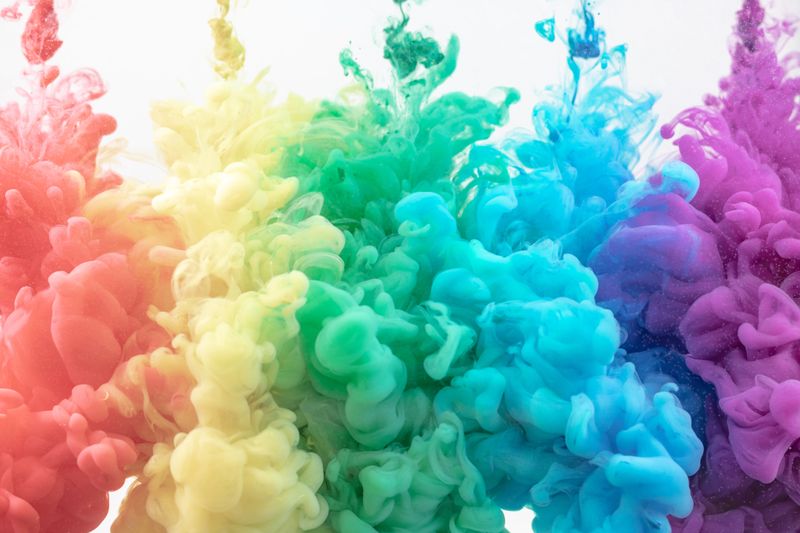 Photo by Paweł Czerwiński on Unsplash
What about these?
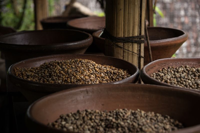 Photo by Andrey Bond on Unsplash
Or these?
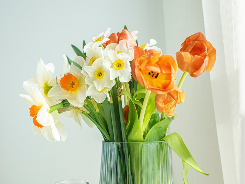 Photo by Larisa Birta on Unsplash
Selecting a color palette for your decorating project is very personal, but it's not hard to do. Try one of these methods to select colors that are right for you!
Find inspiration around you
Think about mood
Check the Color Wheel
Follow the 60/30/10 rule
Find Inspiration Around You
Clothes

This outfit might inspire a palette that includes a gray background with pops of red and black.
Textiles
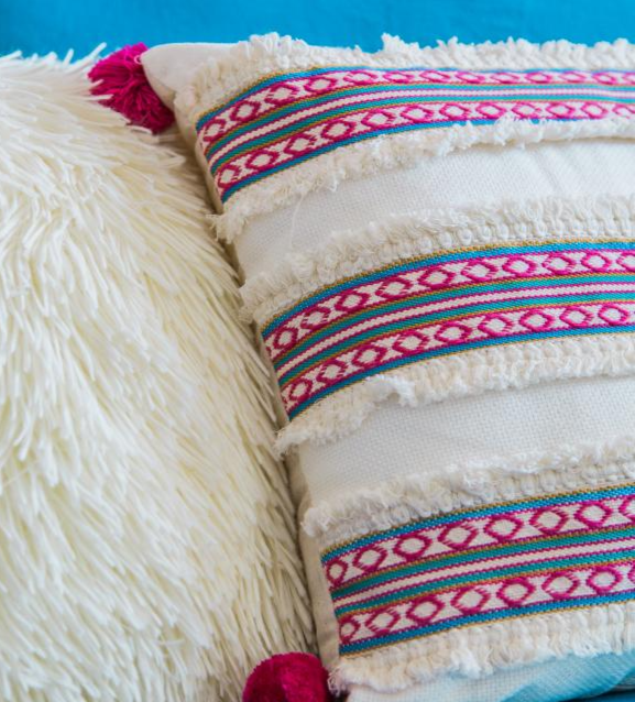
Do you already have pillows, curtains, or fabric that you love? Use those for color inspiration.
This pillow has personality, texture, and a vibrant color palette!
Try a white background along with pinks and blues in bold hues.
Nature
What better way to get inspired than to take a stroll through nature?
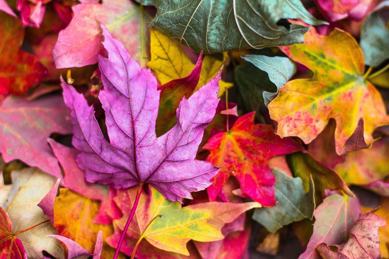 Photo by Jeremy Thomas on Unsplash
Animals
You'll find marvelous color combinations in the animal kingdom!
 Photo by David Everett Strickler on Unsplash
Did you know?
Guess The Palette
Tia's Decor
Tia has a classic style and tends to wear clothes in soft shades of pink and blue. Which of these palettes might be best for her decor?
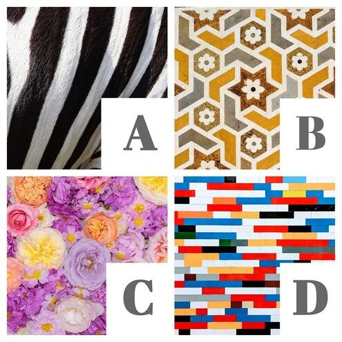
Quiz
Which palette should Tia select?
Mood
Decide what mood you want to create:
 Photo by Jay Castor on Unsplash
Cool and lighter tones like green, blue and pastels, are soothing.
 Photo by bady abbas on Unsplash
Warm and bright colors like red, orange, and jewel tones, are energizing.
Quiz
What mood do you think a black and white color palette creates?
Did you know?
Subscribe for more quick bites of learning delivered to your inbox.
Unsubscribe anytime. No spam. 🙂
Check The Color Wheel

The Color Wheel
Complementary colors are opposite each other on the color wheel. Using them together provides a lot of drama and contrast.
Analogous colors are next to each other create a cohesive look. Professional decorators recommend using 2-3 analogous colors in a row, and adding small amounts of a contrasting color.
TONE IT!
You can tone the pure colors of the color wheel by going lighter or darker.

Examples:
Pure red and pure green might not result in a pleasing color scheme, but pink (light red) and light green look great together!
Pure purple along with pure yellow might be overwhelming, but eggplant (dark purple) and gold (dark yellow) go well.
Follow The 60/30/10 Rule
Using colors in the following amounts will always result in a harmonious and professional look!
60% of your main color
30% of a secondary color
10% of an accent color

Choose the Palette

Quiz
Rico paints the walls red and buys blue chairs. What accent color should he choose?
Take Action
Jump into your next decorating project!

Your feedback matters to us.
This Byte helped me better understand the topic.