

Have you ever wondered what a dyslexic person goes through?
Imagine a quiet room. Thomas, who is dyslexic, is reading a book. The text is printed in a standard font, with tightly spaced letters. As he reads, the words seem to blur and move while letters swap places.
All of a sudden, he feels frustrated. The effort it takes to read a paragraph is exhausting.
As an educator, you can help your students avoid this frustration by selecting dyslexia-friendly fonts for educational materials.
What is dyslexia? How does it affect learners?

Dyslexia is a learning disability that makes it difficult to read and complete language-related tasks.
These issues can include difficulties in word recognition, poor spelling, and decoding abilities among others.
This can have a great impact on the reading process, since there are usually difficulties in attention and organization and confusion with concepts related to time and space.
Did you know?
Accommodating students with dyslexia

Specific accommodations are needed for dyslexia. Dyslexia-friendly fonts can play a very important role.
Sans-serif fonts are suggested by educators because they don't have extending features called "serifs" at the ends of letters and numbers, so they're simpler to read. According to research, sans-serif fonts improve reading speed and comprehension.
Some examples of sans-serif fonts are:
Open-Dyslexic
Arial
Comic Sans
Verdana
Tahoma
Characteristics of dyslexia-friendly fonts
The readable fonts for dyslexia should be aligned with the following characteristics:
Font size should be 12-14 point or equivalent.
Larger inter-letter spacing improves access, approximately 35% of the average letter width.
Larger line spacing contributes to readability.
Italics and underlining should be avoided.
Lower case letters are easier to read.
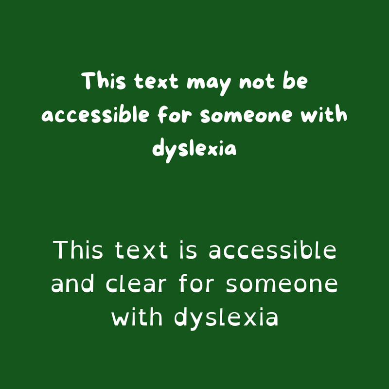 Image courtesy of the author, created in Canva.
Quiz
Why is increased letter spacing important in dyslexia-friendly fonts?
Subscribe for more quick bites of learning delivered to your inbox.
Unsubscribe anytime. No spam. 🙂
Other things to consider
Apart from using the right fonts, it's essential to consider color and layout.

Use single-color backgrounds. This can reduce visual stress and distractions.
Apply effective contrast levels. For example, high contrast, such as black text on a cream-colored background, is traditionally recommended.
Align the text to the left, without justification. This can help readers track where lines begin and avoid getting lost.
Write short, simple sentences. This is useful to reduce the effort to decode the language.

Avoid using white backgrounds. They can be highly reflective and cause discomfort.
Don't use green or pink. They don't provide sufficient contrast with text and are really vibrant.
Avoid multiple columns. This can impede reading flow.
Don't write long, complex sentences. In general, they contain multiple ideas and complex structures that require greater cognitive processing.
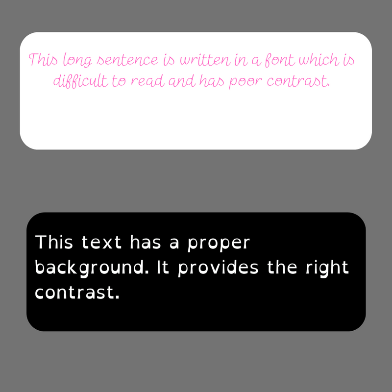 Image courtesy of the author, created in Canva.
Quiz
The text on the workbook page is in Arial font with narrow spacing. Which font change would be the best for dyslexic readers?
Inserting fonts in education materials

As teachers start to adapt materials for dyslexia, they often find inserting fonts challenging.
With OpenDyslexic.org, teachers can download the fonts for free and adapt their use to Chrome or Google Docs.
Another useful tool is Font Converter for Dyslexia, where you can paste in your text and it will automatically adapt to a suitable font.
Take Action
Choosing the right dyslexia-friendly fonts for education materials can be a challenge, but it will benefit your class!

Your feedback matters to us.
This Byte helped me better understand the topic.