 Photo by Aleks Dorohovich on Unsplash
Welcome to logo design — the fast track to a logo that rocks! We’ll guide you step-by-step from idea to polished logo, no pro skills are needed.
Here's the game plan:
Discover what makes a logo unforgettable.
Pick colors and fonts with flair.
Sketch and refine with easy tools.
Test your masterpiece!
Why? Because a logo is more than a design — it’s your brand’s shout-out to the world. Create something awesome with this step-by-step guide!
 Photo by Jan Rosolino on Unsplash
Did you know?
1. Understand the Purpose of a Logo
Why Is a Logo Important?
It’s more than just a pretty design — it’s a symbol that represents your brand’s identity.
The Theory Behind It
Semiotics in design: Ever wonder why certain logos just click with you? That’s semiotics at work! It’s all about how shapes, colors, and fonts act as visual cues that send messages and spark emotions. A great logo uses these elements to form an instant connection with your audience, without needing a single word.
When you look at a logo, there are 3 main parts to think about: the signifier, the signified, and the referent.
The signifier is basically what you see — the shapes, colors, and fonts used. For example, if a logo has soft, round shapes and warm colors, it might feel friendly and inviting.
Then there’s the signified, which is all about what those visuals mean. This could be the brand’s vibe or what it stands for, like being innovative or eco-friendly.
Finally, the referent is what the logo actually represents in the real world, like a company or a product.
By understanding these layers, we can see how a logo isn’t just a pretty picture — it tells a story and connects with people on a deeper level!
Activity ✅
Think of a logo you love (like Apple or Nike). What feelings or ideas come to mind when you see it? That’s the magic of semiotics!
 Photo by Domino Studio on Unsplash
2. Do Research and Find Inspiration
Do Your Research
Before you get started with your design, it's important to know who you're designing for. Research your audience and competitors to see what’s out there and what will resonate with your target market.
Find Inspiration
Check out creative logos on sites like Pinterest or Behance to spark your creativity. Pay attention to trends and styles that catch your eye!
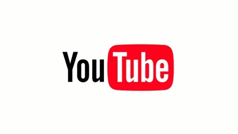
Let’s break down the YouTube logo:
Clear font: The logo uses a bold and simple font for "YouTube," making it super easy to read. This helps people know right away what it is!
Play button: The red play button in the logo is a big deal! It represents videos and invites people to click and watch, showing exactly what YouTube is all about.
Bright colors: YouTube sticks with red and white, which makes the logo pop! Red gives off a fun and energetic vibe, while white keeps it clean and simple.
Compact shape: The logo has a rectangular shape with the play button inside, making it look balanced and neat. This design works well on all sorts of devices and platforms.
Easy to remember: All these features make the YouTube logo super memorable. That red play button is now a symbol for watching videos everywhere you go!
In short, the YouTube logo is designed to be eye-catching, easy to understand, and instantly recognizable, which is key for connecting with its audience.
3. Choose Your Style and Type
Pick Your Style
Is your brand modern and sleek? Or maybe vintage and playful? Deciding on a style early on will help guide all your design decisions.
Logo Types
Did you know there are different types of logos? You can go with a wordmark (just text), a lettermark (think initials), an icon, or even a combination of these. Each one says something different about your brand.
The Theory Behind It
Dual coding theory: This is all about mixing visuals and words to help people remember things better. When you choose the right logo type and style, you're pairing imagery with words in a way that sticks in people’s minds. It’s like giving your audience a little mental shortcut to remember your brand.
Activity ✅
Think about your brand’s personality. Is it bold and adventurous? Simple and clean? Choose a style and logo type that fits, and jot down a few ideas.
Subscribe for more quick bites of learning delivered to your inbox.
Unsubscribe anytime. No spam. 🙂
4. Pick Colors and Fonts
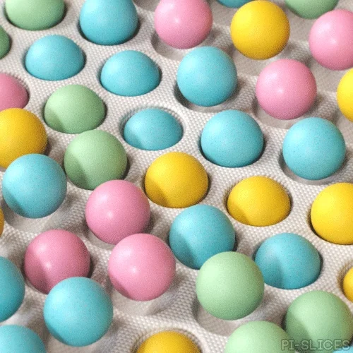
Choose Your Colors
Colors aren’t just for looks — they create emotions! For example, blue can feel calm and trustworthy, while red brings excitement. Pick colors that match the vibe you want for your brand.
Choose Your Font
Just like colors, fonts have their own personalities. Sleek and modern fonts work well for tech brands, while playful fonts might be perfect for a kid’s brand. Make sure your font matches the style you’re going for!

The Theory Behind It
Color theory & cognitive load: Colors can seriously influence how people feel about your brand (hello, color psychology!). And when it comes to fonts and overall design, less is more. Too many flashy colors or hard-to-read fonts can overload your audience's brain (aka "cognitive load"). The trick? Keep it simple, so people get the message fast without feeling overwhelmed.

Activity ✅
Imagine you're tasked with designing a logo for a high-end bakery named Golden Crust. The bakery specializes in artisan breads and pastries, appealing to an upscale, health-conscious clientele. The brand aims to communicate luxury, warmth, and trustworthiness.
Pick a few colors and fonts that fit your brand’s personality. You can use tools like Coolors for color inspiration or Google Fonts to explore different font styles.
Quiz
Which logo colors work best for the Golden Crust brand? Select all that apply:
Did you know?
5. Draft and Refine Your Logo

Sketch It Out
Now that you have your style, colors, and fonts, it’s time to start drafting. Don’t worry about perfection — just get your ideas on paper or screen. You can use tools like Canva or even start with a simple sketch.
Refine, Refine, Refine!
Your first draft won’t be the final one, and that’s okay! Keep refining your design —play with the layout, try different font sizes, and adjust the spacing until it feels just right.
The Theory Behind It
Iterative design process: Design is all about iteration — making something better through repeated refinement. This concept comes from the design thinking framework, where each draft gives you a chance to test ideas, get feedback, and improve the final product. So don’t get frustrated if it takes a few tries — that’s part of the process!
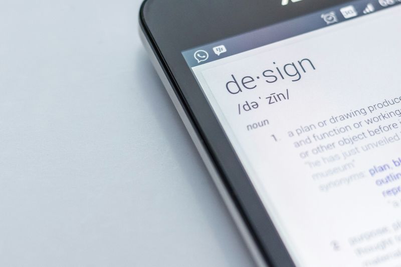 Photo by Edho Pratama on Unsplash
Activity ✅
Create your first draft of the logo using Canva or your preferred tool. Then, make at least three adjustments — whether it’s changing the colors, resizing the fonts, or tweaking the layout. Don’t stop until it feels just right!
6. Finalize and Test Your Logo
Get Feedback
Before you call it done, get some fresh eyes on your logo. Share it with friends, colleagues, or your target audience to see what they think. Sometimes, others can spot things you might have missed!
Test It Out
How does your logo look in different settings? Try placing it on a website, business card, or social media profile to make sure it works everywhere.
The Theory Behind It
Feedback loops: Feedback loops refer to the cycle of receiving feedback, reflecting on it, and making adjustments based on that reflection. This iterative process enhances learning by allowing learners to identify strengths and areas for improvement.
 Photo by Marielle Ursua on Unsplash
Activity ✅
Share your logo with at least three people for feedback. Then, test it on different platforms (like a mockup website or social media) to see if it holds up in various sizes and formats.
Quiz
You’ve designed a logo for an eco-friendly cleaning company. What’s the best way to get actionable feedback?
7. Put Your Creativity to Work!
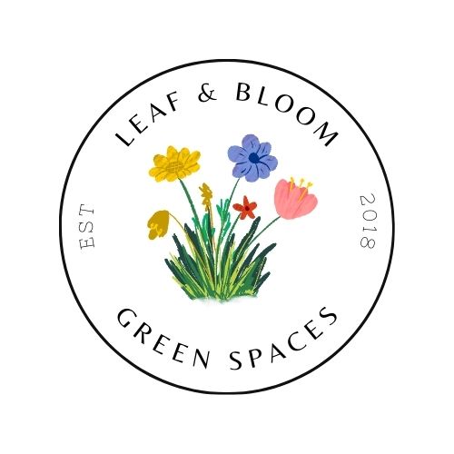
Let's design a logo! Imagine you've been hired to create a logo for a new company, Leaf & Bloom, which provides services in indoor gardening, plant care, and sustainable landscaping. Leaf & Bloom wants a logo that reflects its mission of nurturing plants while promoting environmental sustainability.
Using your design skills, create a simple logo that captures the essence of Leaf & Bloom. Share your final design and explain your choice of colors, shapes, and any symbols or fonts used. How does your logo communicate the brand’s mission?
Create the icon: Combine a leaf and a blooming flower to symbolize growth and care.
Choose colors: Use earthy tones like green and beige with a pop of bright color for the bloom.
Select a font: Go for a sleek, rounded sans-serif font for a friendly, professional look.
Sketch your design: Draft your logo using a sketchpad or design tool.
Refine and finalize: Adjust details like layout, size, and spacing, then test it in different settings.
Export your logo: Use a high-quality format (e.g., PNG or SVG) for your export and share it with a class or group for feedback.

Design your version of the Leaf & Bloom logo using the steps above. Once you’re happy with it, share it with a friend or colleague to get feedback on your design! Here's mine:
Take Action
A successful logo is simple, memorable, and rooted in the principles of visual perception and cognitive load.
By applying the steps and theories covered in this Byte, you can design a logo that effectively communicates your brand identity.

Now that you've got the basics of logo design down, keep that creative momentum going! Take these steps to sharpen your skills and grow as a designer:
Your feedback matters to us.
This Byte helped me better understand the topic.
