

Image by storyset on Freepik and re-colored by Byte author.
When we think about how things are designed from an accessibility lens, often many learners or users are left out.
How would your life be impacted as a learner if you couldn't hear? What would be helpful?
In this situation, clear-plastic face masks are a great tool for more accessible learning.

Image by storyset on Freepik and re-colored by Byte author.
Create a more accessible space to make sure all your learners fully benefit from your learning content!
Did you know?
Why is accessible design important?
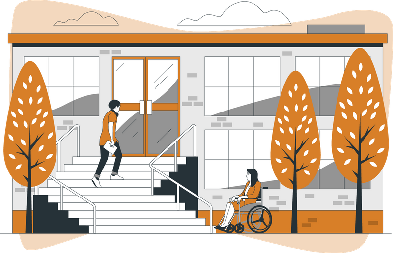
Image by storyset on Freepik and re-colored by Byte author.
Example #1 — an architectural design that doesn't have accessibility in mind:
Imagine going to your new class, but there is no readily available ramp to get to the main front door with your wheelchair.
Instead, you find stairs and now have to look for a ramp or elevator around the building which could make you late and miss part of the lecture.
This isn't great because it takes longer time to reach the side ramp than the main stairs.
Accessible architectural design and learning design aren't that different.
These two types of design share similar goals, such as creating environments that accommodate the diverse needs of people in our community that we interact with.
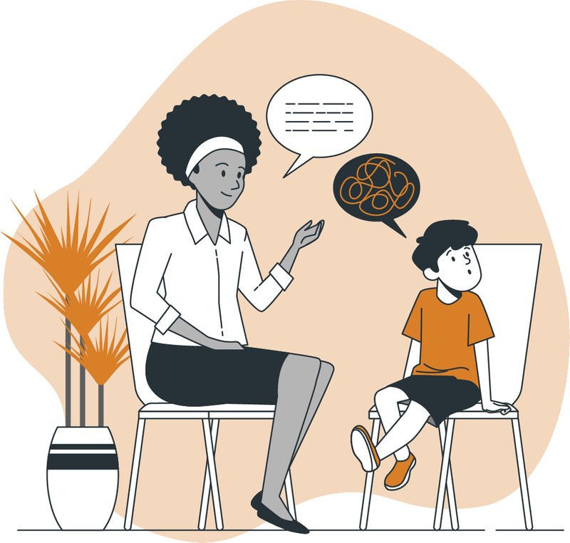
Image by storyset on Freepik and edited by Byte author.
Example #2 — learning design that does have accessibility in mind:
Imagine going to training as a learner with attention-deficit/hyperactivity disorder (ADHD) and getting a handout of the class notes from your instructor at the beginning of class to follow along.
This is great because you might often have trouble paying attention to auditory lessons for a long period of time and you might miss some key spoken words.
Did you know?
Accessible design requires empathy.

Image by storyset on Freepik and re-colored by Byte author.
More than ever, it's common to encounter people with invisible disabilities.
...an invisible disability is a physical, mental or neurological condition that is not visible from the outside, yet can limit or challenge a person’s movements, senses, or activities.
— Invisible Disabilities Association
Regardless of someone's identity, including age, they may have a physical, mental, or neurological disability that can't be seen by just looking at them. It's very important to always reflect on our own biases and lean into empathy to seek understanding.
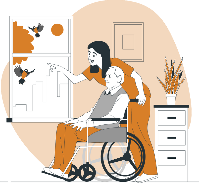
Image by storyset on Freepik and re-colored by Byte author.
Empathy allows you to understand learner barriers and limitations.
Empathy (noun): the action of understanding, being aware of, being sensitive to, and vicariously experiencing the feelings, thoughts, and experience of another.
— Meriam Webster Dictionary
Empathy is a tool that will allow you to be a better designer from the beginning of your design process by considering the abilities, disabilities, preferences, limits, culture, socioeconomic class, and life circumstances of all of your learners.

Image by storyset on Freepik and edited by Byte author.
Inclusive learning design with accessibility at the forefront reaches more learners.
...an inclusive design approach is one that perceives disability as a mismatch between our needs and the design features of a product, built environment, system or service.
— The Inclusive Design Guide
Accessibility is always the right thing. It provides equitable learning experiences, reaches more learners, and benefits everyone, including you as an educator.
There are often legal requirements for accessibility compliance in design. Avoid re-designing a finished product without consulting an accessibility specialist in your learning organization!
Did you know?
What are common accessible learning design practices?
 Image by storyset on Freepik and re-colored by Byte author.
1. Use reader-friendly typeface and fonts.
There is no single typeface or font that is the standard for accessibility, since every person has unique needs. It's recommended to avoid cursive and use simple fonts like:
Arial
Tahoma
Verdana
Helvetica
Time New Roman
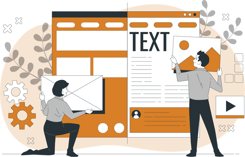
Image by storyset on Freepik and re-colored by Byte author.
2. Use colors with high-contrast between text and background.
Visual ability is on a spectrum. Select text and background color mindfully. According to Web Content Accessibility Guidelines (WCAG) 2.1 AA, it's best to use images of text and text with a 4.5:1 contrast ratio with some exceptions, such as text in logos.
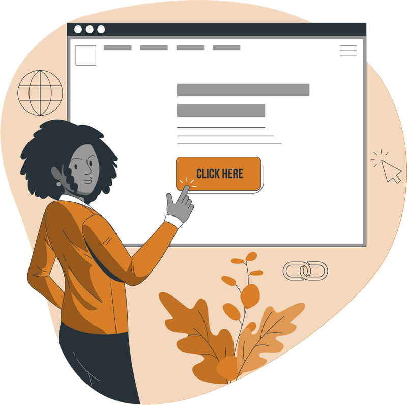
Image by storyset on Freepik and re-colored by Byte author.
3. Use meaningful website link descriptions.
When designing and writing for accessibility, it's critical to think about how people that use screen readers, such as blind learners, experience your designs in class, especially for website links.

Not accessible:
Vague descriptions
Entire website URL links
Same text for different links
"Click here", "Learn more" or "Read this"

More accessible:
Longer descriptions
Meaningful word choice
Unique text for each link
More specific language
Quiz
Which of the following is a strong alternative text description for an image?
Did you know?
Subscribe for more quick bites of learning delivered to your inbox.
Unsubscribe anytime. No spam. 🙂
What about information and visual layout in design?
Image by storyset on Freepik and re-colored by Byte author.
1. Use alternative text descriptions for images.
Use alternative text descriptions, also known as alt text, for all appropriate images in your digital courses, lesson, PDFs and other materials. Refer to WCAG 2.1 or other local or national guides for more details and exceptions.
Image by storyset on Freepik and re-colored by Byte author.
2. Use short descriptions and minimize information lines for content.
When possible, use 1-2 lines of text in lists or chunk paragraphs for easier readability, especially for learners with screen readers that hear the text. Try not to use too many filler words.
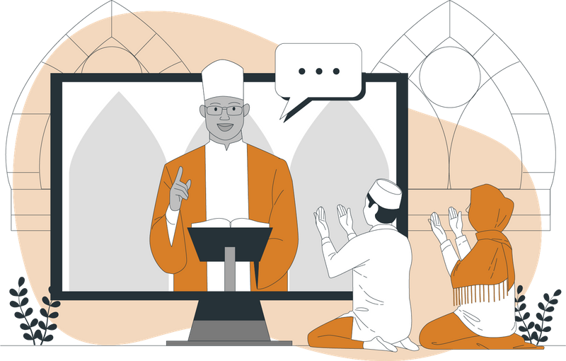
Image by storyset on Freepik and re-colored by Byte author.
3. Use accurate text alternatives with audio or video media.
According to WCAG 2.1 AA, always include accurate text transcripts with audio and closed captioning (also known as subtitles) to videos.
Image by storyset on Freepik and re-colored by Byte author.
4. Use headings and their levels in a logical order.
People that use screen readers benefit from programmatically tagged headers. The World Wide Web Consortium (W3C) Web Accessibility Initiative (WAI) advises to order most important headings at rank 1 <h1> to least important at rank 6 <h6>.
Did you know?
Take Action
Image by storyset on Freepik and re-colored by Byte author.
Get started on making your learning designs more accessible:
Did you know?
Your feedback matters to us.
This Byte helped me better understand the topic.