Everyone has bias, even instructional designers.
 Image by storyset on Freepik
Bias can unintentionally exclude people from a successful learning experience — especially learners who belong to groups of people who have been left out historically.
It's your responsibility as instructional designer to reflect on your biases. That's where Justice, Equity, Diversity, and Inclusion (JEDI) come in. Apply them to your instructional design process to reach as many learners as possible!
Did you know?
What are JEDI principles?
JEDI is an acronym for:

Image by storyset on Freepik
J for Justice — Breaking down barriers to opportunities and resources so that all members of a community thrive as a collective.
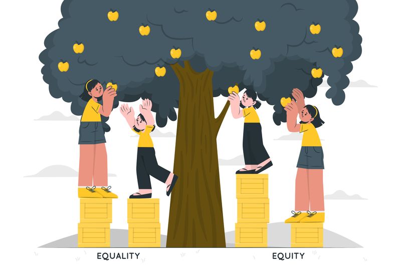 Image by storyset on Freepik
E for Equity — Dispersing resources accordingly for access and acknowledging identity advantages and disadvantages.
 Image by storyset on Freepik
D for Diversity — Addressing differences in intersectional identities and how these identities are given certain barriers in our societal systems.
 Image by storyset on Freepik
I for Inclusion — Valuing all perspectives, creating a sense of belonging, and amplifying voices, especially those that encounter more barriers than others.
Did you know?
Why are JEDI practices important?
 Image by storyset on Freepik
Designing with JEDI practices cultivates a sense of belonging and increases the access that learners will have with your content, while honoring diverse perspectives and the reality of historical inequity in marginalized identity groups.

Don't:
Showcase diverse people only once as an accessory in your image choices
Avoid self-reflection and stay comfortable with your words and writing
Use creators from one region only, like authors, artists, and knowledge
Celebrate only specific holidays for black, indigenous, and people of color
Isolate yourself from networking with leaders who want to lift you up
Ignore offensive messages in your team or any work you review

Do:
Showcase diverse people in everyday life in your images with many identities
Address your own biases by carefully choosing your words and language
Attribute global creators from many countries to include varying perspectives
Act every day on equitable design practices in your own work
Collaborate with others to grow and become better a instructional designer
Address and suggest changes to content that has offensive messages
Did you know?
Ways to apply JEDI principles to your designs

Example #1 — Intentional image selection
Whenever possible, try using images that show people with:
Varying ages, body types, abilities, skin tones, hair styles, and clothing
Diverse representation of gender, sexual orientation and relationships
Different nuclear family models, such as single parents, adoptions, and legal guardians
Multicultural traditions, holidays, and religious beliefs

Example #2 — Meaningful alternative text descriptions for images
Try having meaningful descriptions in alt text descriptions like:
"Young smiling feminine-presenting adult with dark melanin skin and braids acing a calculus exam in a classroom."
"Old frowning masculine-presenting person with medium skin tone color is pacing the building thinking about which flowers to buy for his boyfriend."
"Small feminine-presenting child with light skin tone color is wearing a hijab and long dress. She is reading an anatomy textbook for a biology lab class."

Example #3 — Wording that is mindful of personal biases
Try not to make assumptions about your learners':
Race, culture, traditions, religion, or lifestyle
Gender, sexual orientation, or romantic partners
Socio-economic or family situation
Learning preferences, mental health conditions, abilities, or disabilities
Intelligence level, reading comprehension, and motivation

Example #4 — Design with accessibility at the forefront
Try designing with accessibility in the plans from the beginning with:
Live and asynchronous closed-captioning for videos
Accurate transcripts for all video and audio content
Image descriptions below images wherever possible
High contrast between the text and background colors
Did you know?
Subscribe for more quick bites of learning delivered to your inbox.
Unsubscribe anytime. No spam. 🙂
Take Action
 Image by storyset on Freepik
Start applying JEDI practices to your instructional designs!
Did you know?
Your feedback matters to us.
This Byte helped me better understand the topic.
