David is studying to pass the IELTS exam, but he wasn't aware that Writing Task 1 of the writing test includes many different types of questions.
The IELTS Writing section is typically the hardest part of the exam, where candidates get lower band scores.

Through learning about sample questions and practicing answering them, David will be able to do well on the exam — and so can you!
Things to Remember
The IELTS Academic test is for people applying for university, a student visa, or proving their English ability to professional organizations. For Writing Task 1,you must analyze data from a graph, table, chart, diagram, or map — and write a report about it.
 Photo by Firmbee.com on Unsplash
Key points:
Spend around 20 minutes on Task 1
Write over 150 words (around 155 to 165)
Task 1 equals about 33% of the overall writing mark
Four marking criteria: Task Achievement, Coherence & Cohesion, Vocabulary, and Grammar
Include an overview: it's difficult to get over a band score of 5 without one
How to Analyze the Data & Structure an Answer
Task 1 is about picking out the differences from the data presented. You need to compare and contrast the data by using a range of different vocabulary to show off your English.
Analysis verbs:
increased/decreased
grew/declined
climbed/dropped
plummeted/soared
Superlatives: the greatest, the largest, the lowest, the smallest, etc.

Typically you should organize your answer into 4 paragraphs:
Intro: Paraphrase the graph statement.
Overview: A summary of the main trends, patterns, or key features of the data, focusing on the big picture.
Two body paragraphs: Here you compare and contrast the data.
Pie Chart: Academic IELTS Writing Task 1 Sample Question
The pie charts below show the distribution of energy sources used to produce electricity in the United Kingdom in 2018. Summarize the information by selecting and reporting the main features, and make comparisons where relevant.
Write at least 150 words.
 Pie charts created by the author in Google Documents. To hear an audio version of the information in the pie charts above, click the play button on the audio player below:
Intro example:
The pie charts illustrate the proportion of different types of power utilized for the generation of electricity in the United Kingdom in 2018. (Notice how the answer is paraphrased from the question).
Bar & Line Graph: Academic IELTS Writing Task 1 Sample Question
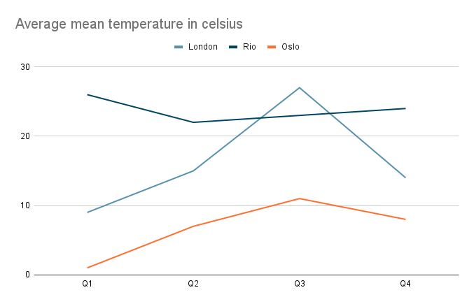
The line graph below shows the average monthly temperature in three different cities in 2022, over four different quarters.
Summarize the information by selecting and reporting the main features, and make comparisons where relevant.
Write at least 150 words.
 Line graph created by the author in Google Documents. To hear an audio version of the information in the line graph above, click the play button on the audio player below:
Overview example:
Overall, Rio consistently had the warmest and most stable climate over the entire year, with temperatures staying in the mid to high twenties. In contrast, London had the biggest variations in temperatures, ranging from lows of around nine degrees to the high twenties. Oslo had the coldest temperatures.
Quiz
Which elements from the graph should you include in your answer?
Table: Academic IELTS Writing Task 1 Sample Question
The table below shows the average monthly local government expenditure in millions of pounds spent on various categories in five different cities in 2022.
Summarize the information by selecting and reporting the main features, and make comparisons where relevant.
Write at least 150 words.
 Table created by the author in Google Documents. To hear an audio version of the information in the table above, click the play button on the audio player below:
Body paragraph example:
Education received the highest funding for all the local councils compared to the other brackets, particularly in Edinburgh which spent £5.2M, and London with £4.5M respectively. Despite having lower overall spending when measured against the other towns, Leeds invested £2.3M in education as well.
Map: Academic IELTS Writing Task 1 Sample Question
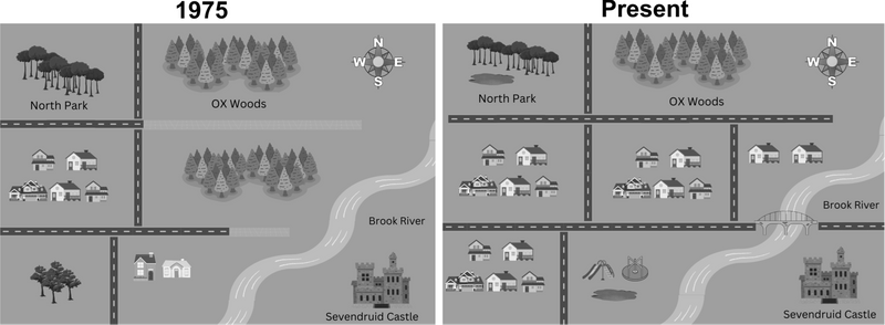
The maps below show the changes that have taken place in the town of Stonehouse since 1975. Summarize the information by selecting and reporting the main features and make comparisons where relevant.
Write at least 150 words.
 Map created by the author in Canva. To hear an audio version of the information in the map above, click the play button on the audio player below:
Overview example:
Overall, the main difference was the removal of the extensive woodlands in the center and southwest areas of the settlement. These forests were replaced by new large housing projects in the central, eastern, and southwestern areas, which approximately tripled the town's size.
Diagram: Academic IELTS Writing Task 1 Sample Question
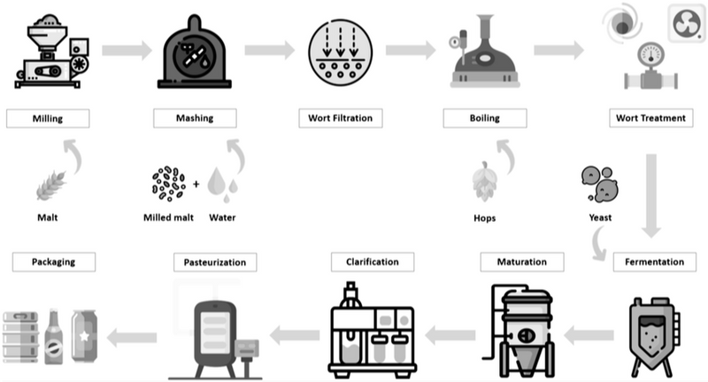
The process diagram details the beer brewing process and the raw materials used. Summarize the information by selecting and reporting the main features and making comparisons where relevant.
Write at least 150 words.
 Processing Technologies in Beer Production (Creative Commons Attribution 4.0)
To hear an audio version of the information in the diagram above, click the play button on the audio player below:
Body paragraph example:
The process begins with malt, which is milled before being combined with water in the mashing stage. The resulting mixture, called wort, undergoes filtration, after which hops are added, and the liquid is boiled. The process then continues onto the Wort treatment.
Quiz
What sort of vocabulary should you use for this diagram?
Take Action
Continue learning about different parts of the IELTS exam.

Your feedback matters to us.
This Byte helped me better understand the topic.
