
You spend countless hours creating the perfect resume.
The hiring manager takes one look and quickly puts your carefully crafted document in the "no" pile.
 Photo by Sander Sammy on Unsplash
How did this happen!?
Hiring managers can be really picky, and if they see something they don't like, they can make a snap judgment...even when it comes to your resume's font choice!
Choosing the best font for your resume will help you avoid being thrown into the "no" pile.
Did you know?
Who sees your resume
Your resume will most likely be viewed by at least two sources: the Applicant Tracking System (ATS) software and a human employer (i.e. the hiring manager or recruiter).
 Photo by Thought Catalog on Unsplash
In either case, your resume or CV should be easily read and professional. Choosing the wrong font can prevent you from landing your dream job.
Your choice of font (or typeface) on a CV or resume is as important as how you choose to dress for an interview.
Here are five tips to help you create a readable yet aesthetically pleasing resume.
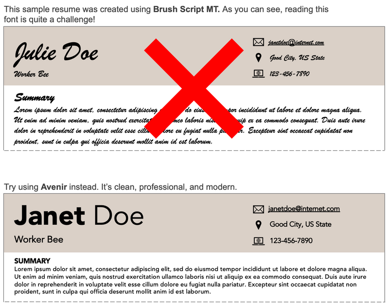
1. Ditch the fancy cursive lettering
Intricate or decorative resume fonts may be difficult to read. Choose either a serif or a sans serif font.
Avoid script fonts and display fonts.
Did you know?
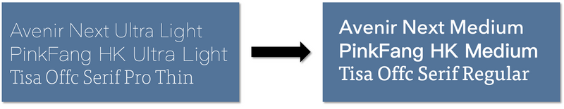
2. Don’t choose a thin or light font
Light resume fonts may be hard to read. Instead, opt for medium-weight lettering. If you happen to find a lighter font you like, use the heavier version, as shown below.
Subscribe for more quick bites of learning delivered to your inbox.
Unsubscribe anytime. No spam. 🙂
3. Be mindful of the font size
Large resume fonts limit space for content and small fonts can be difficult to read.
The main content in your resume should be between 10-12 pt font.
Headers and section titles should be 12-16 pt font.
4. Use no more than 2 fonts
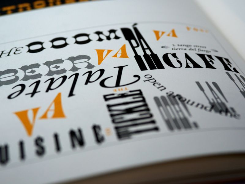 Photo by Brett Jordan on Unsplash
According to Indeed.com, it is best to use one or two fonts. This keeps your resume consistent, resulting in a cleaner look. Consider bolding, italicizing, or increasing the font size to differentiate section headers.
Here is a font selection site that you can use to choose the right pair of fonts.
5. Consider the message your font sends
Some fonts are associated with themes that aren’t generally considered to be professional. When in doubt, choose something simple and stylish.
Here are some fonts to avoid:


QUIZ TIME!
Dan, the hiring manager, scanned these 4 resumes. Who will most likely continue to the next round of the hiring process?
A. Paul has 15+ years of industry experience. He uses 7.5pt font to fit all his accomplishments on 1 page.
B. Rita is highly creative. She uses a beautiful cursive font style for her resume.
C. Lyle has over a decade of experience. He uses 11.5 sans-serif font when listing his most important achievements.
D. Kain is accomplished in the industry. They use an ultra-light font to ensure all the content fits the page.
Quiz
Choose the correct answer.
Examples
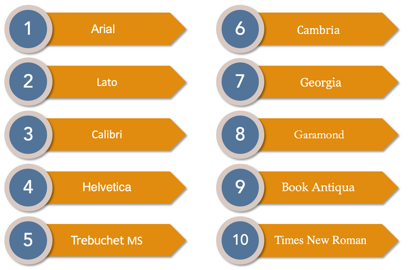
According to Resume Genius, the best fonts of the year are:
Take Action
 Photo by Sebastian Herrmann on Unsplash
Are you ready to make your resume stand out?
Your feedback matters to us.
This Byte helped me better understand the topic.