Did you know that approximately 15-20% of the world's population has some form of dyslexia, a learning disorder that affects a person's ability to read and write?
The modern world relies on text-written communication. Given that dyslexia is so common, it's up to you to ensure that your documents have dyslexia-friendly fonts.

Those with dyslexia find some fonts easier to read than others, so when creating documents, you'll want to consider the following:
Characteristics of dyslexia-friendly fonts
Which fonts are most dyslexia-friendly?
Other considerations for a dyslexia-friendly document
Characteristics of Dyslexia-Friendly Fonts
 Use
Use
Black font
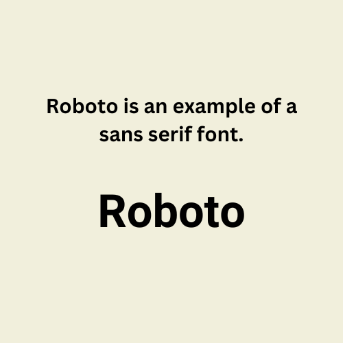
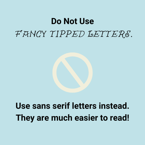
Sans serif font
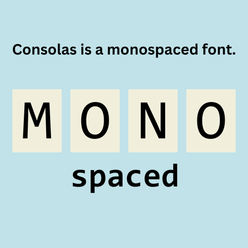
Monospace
 Avoid
Avoid
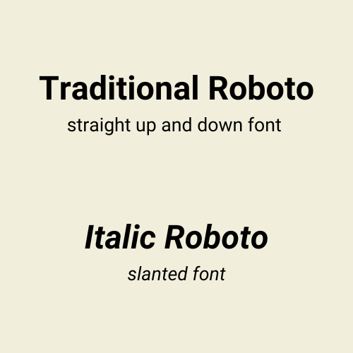
Italics
Obliques
How do these characteristics make for dyslexia-friendly fonts in documents?
Black font on a light-colored background helps create a contrast that isn't overwhelming. Avoid a bright white background.
The sans serif font is without fancy tips, making the letters easier to identify.
Monospace font uses the same width space for each letter in a word, allowing for a uniform appearance and better readability.
Avoid using italic and oblique fonts that slant because they may make the text appear to blend together.
Quiz
You've learned that your new hire, Andrew, is dyslexic and often finds it tough to read documents. What can you do with company documents to improve readability for Andrew and others? Choose all that apply:
Did you know?
Which Are the Most Dyslexia-Friendly Fonts?
Dyslexic readers typically find documents using the following fonts the easiest to read:
Arial
Courier
Helvetica
Tahoma
Verdana
Roboto

These fonts improve the readability of documents because they offer one or more dyslexia-friendly font characteristics.
Did you know?
Other Considerations for a Dyslexia-Friendly Document
There are more ways to make a dyslexia-friendly document that doesn't require much from the author.

Adjust font size to 12 - 14 points
Use 1.5 line spacing
Bold text to highlight important words
Use a light-colored background, such as a cream shade

Avoid all caps
Avoid underlining
Avoid bright white backgrounds
Subscribe for more quick bites of learning delivered to your inbox.
Unsubscribe anytime. No spam. 🙂
Examples
Does it really make a difference? You be the judge.
A bad example of a professional document:

A good example from a document with a dyslexia-friendly font and other characteristics:

To hear an audio description of the text in the images above, click the play button on the audio player below:
Test Yourself

You are about to send the following document to your coworkers and must consider accessibility. What changes should you make to create a dyslexia-friendly document?

Quiz
Choose all changes that should be made to the document:
Take Action
Your feedback matters to us.
This Byte helped me better understand the topic.


