Did you know that as much as 20% of the entire population shows symptoms of dyslexia?

It's one of the most common learning disabilities and impacts key ways we all communicate: reading and writing.
If you want to reach that 20% with your signs, catalogs, blog posts, or any other marketing materials, you'll need to consider dyslexic-friendly fonts.
Dyslexia: The Signs
So what is dyslexia?
It is a language-based learning disability that results in difficulties with specific language skills such as:
Spelling
Writing
Pronouncing words
And most importantly, reading
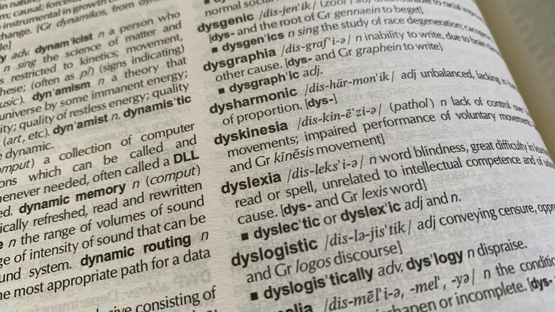 Photo by Rob Hobson on Unsplash
What's the main impact of dyslexia?
The biggest way dyslexia impacts people is with word recognition and reading fluency.
Dyslexia makes reading require more effort. Using dyslexia-friendly fonts could improve your marketing materials and make them more accessible.
Writting: What Makes An Impact
Is there anything that does help those with dyslexia read faster and with fewer errors?
Lots of things! There isn't one magic dyslexia-friendly font that will be simple to read. But, some fonts are easier to read than others. Accessible dyslexia-friendly fonts include:
Simpler letter shapes
Increased spacing between each letter
Straightforward ascenders and descenders (the tail of letters like b, d, g, and y)
Consistent letter height
Bolder and heavier lines
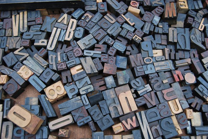 Photo by Amador Loureiro on Unsplash
So what is a dyslexic-friendly font?
Any font that is sans-serif is more accessible for those with dyslexia. Examples of dyslexia-friendly fonts include:
Arial
Comic Sans
Verdana
Tahoma
Century Gothic
Trebuchet
Calibri
Open Sans
After applying these tips, your marketing will be clearer than ever to everyone, including those with dyslexia!
Proprietary Dyslexia-Friendly Fonts: The Facts
You might consider a proprietary dyslexia-friendly font (a font designed specifically for people with dyslexia). Dyslexie is a subscription-based font that claims to be easier to read by those with dyslexia. OpenDyslexic is a free-to-download font that states the same. But do they work?
Studies show that there is no evidence that dyslexia fonts work significantly better. They won't help people with dyslexia read faster or with fewer mistakes. In fact, of those tested, most preferred not to read writings in Dyslexie or OpenDyslexic.
Fonts like Dyslexie or OpenDyslexic might not be magic, but there is anecdotal evidence that they still help some individuals. It's just on a case-by-case basis.
Writting Strategies: Text
Outside of dyslexia-friendly fonts, there are plenty of other strategies to make writing more accessible to people with disabilities.
Format Your Writing
Font size: Use 12 to 14-point font. Some people find larger text easier to read.
Example: Use a larger font in printed materials like pamphlets or catalogs.
Spacing: Make sure there is plenty of space between letters, words, lines, and sections of writing.
Example: Blank space in billboards makes important things stand out.
Emphasis: Use bold instead of italics or underlining to keep letter lines clear.
Example: Sale! is easier to read than Sale!
Lowercase: Capital letters can be harder to read.
Example: Try using "exciting new offer," it's clearer than "EXCITING NEW OFFER".
Writing Strategies: Formatting
You can continue to improve the design of your marketing materials by considering formatting elements that make your information more accessible.
Format Your Structure
Background: Use single-color backgrounds without distracting patterns or pictures.
Example: In front of images on a website, put text in a textbox with a solid background.
Contrast: Make sure letters stand out from the background.
Example: Keep words a dark color over a lighter background.
Layout: Keep text left aligned and avoid using columns.
Example: For online posts, keep your writing in line.
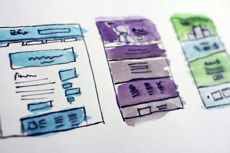 Photo by Hal Gatewood on Unsplash
Quiz
Which things are important to consider when making your marketing material more dyslexia friendly?
Application: Marketing
How can all this help in marketing? Whether you are using printed materials, web pages, emails, billboards, or any other medium, the tips above will still apply to any place with writing.
 Photo by Pawel Czerwinski on Unsplash
Stick to dyslexic-friendly fonts. Some fonts that are eye-catching and great for marketing that also are sans-serif and accessibleare Gill Sans and Museo Sans.
With so many considerations that make writing more dyslexic-friendly, a more accessible and simpler option could be to use a video, audio, or image for the information you want to convey.
Take Action
There is no perfect dyslexia-friendly font to use, but there are many sans-serif options that make your writing easier to read. Considering your font choice as well as other formatting factors can make your marketing materials more accessibleto everyone.
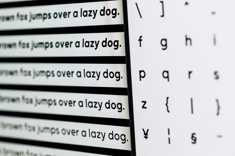 Photo by Markus Spiske on Unsplash
Your feedback matters to us.
This Byte helped me better understand the topic.
