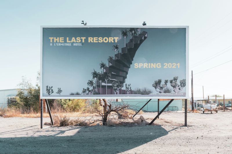
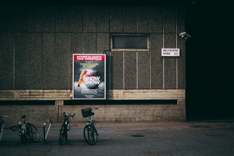
Posters are pivotal in business promotion and serve as an impactful marketing tool. Creating an eye-catching poster to promote your business is a fun and creative process!
Have you ever thought about the magic behind these attention-grabbing posters? Or have you ever tried designing one for your business?
No more waiting! Design a poster that grabs attention and effectively communicates your message.
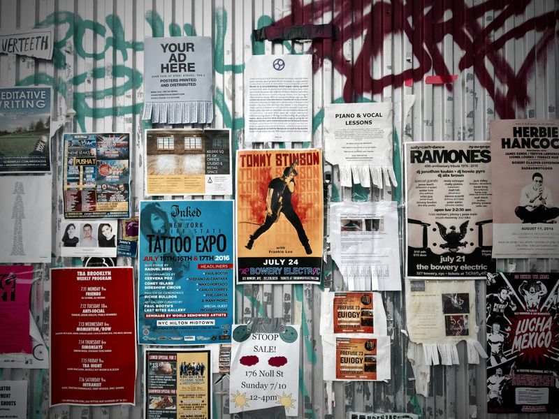 Photo by Yonghyun Lee on Unsplash
Step 1: Define Your Purpose and Audience
 Photo by Jonas Jacobsson on Unsplash
Kick-off with a clear goal!
Purpose: What's the main aim of your poster? Are you advertising a sale, launching a new product, hosting an event, or boosting brand awareness? Define this clearly.
Audience: Who are you speaking to? Identify your target audience to tailor your design and message to their preferences.
Step 2: Plan Your Content
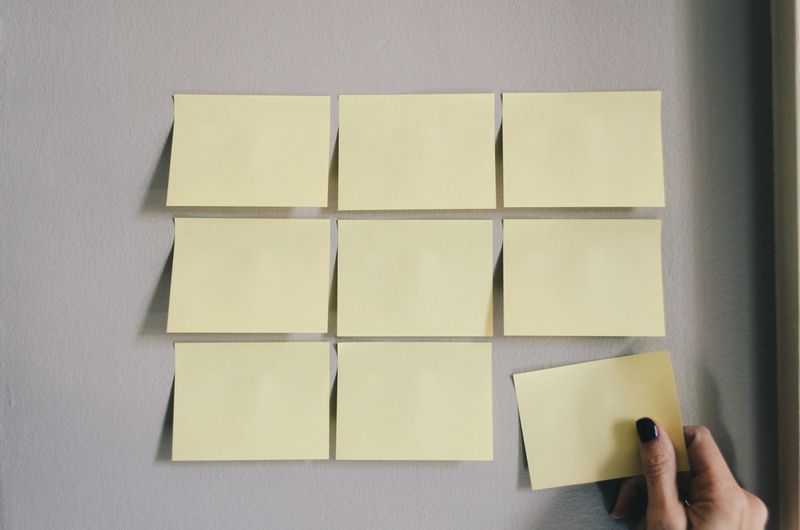 Photo by Kelly Sikkema on Unsplash
Craft your message!
Headline: Write a bold and compelling headline that captures interest immediately.
Message: Keep it short and sweet. Highlight the key benefits or features.
Call to action (CTA): Encourage your audience to act with a strong CTA like “Visit Us Today,” “Shop Now,” or “Call to Reserve.”
Contact information: Don’t forget the essentials — your business name, address, phone number, website, and social media handles.
Quiz
Riya runs a clothing store. She has planned to organize an "End of Season" sale on 4th Saturday of this month. She has designed a poster to put in front of the store on that day. Which of the following is the best CTA for the poster?
Step 3: Choose the Right Dimensions
 Photo by Siora Photography on Unsplash
Pick the perfect size!
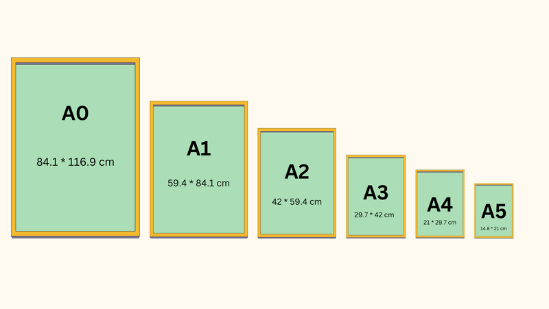
Size: Decide where your poster will be displayed and choose a size accordingly.
Common sizes are:
A4 (21 x 29.7 cm)
A3 (29.7 x 42 cm)
A2 (42 x 59.4 cm)
Larger sizes are:
A1 (59.4 x 84.1cm)
A0 (84.1 x 116.9cm)
Step 4: Select Visual Elements
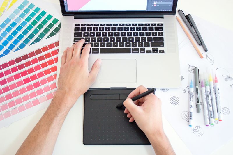 Photo by Theme Photos on Unsplash
Design with impact!
Images: Select high-quality images that are vibrant and relevant to your message.
Colors: Use colors that match your brand.
Color combinations: Ensure good contrast for readability and consider how colors fit together to create themes.
orange + black = energetic theme
black + white = minimalist theme
purple + lime green = fun theme
navy + gold = elegant theme
blue + white = calm theme
gold + red = festive theme
Typography: Choose easy-to-read fonts and limit yourself to 2-3 different fonts to keep the design clean and cohesive. Some of the great fonts for posters include Times New Roman, Georgia, Calibri, Open Sans, Comic Sans, Futura, and Papyrus.
Quiz
Imagine you're launching a new line of luxury kitchen appliances aimed at young, urban professionals living in city apartments. Your brand embodies modernity. What color scheme would work best for a poster of this new launch?
Step 5: Design Your Layout
Layout for engagement!
Hierarchy: Arrange your elements to guide the viewer’s eye from the headline to the CTA.
Balance: Distribute text and images evenly to create a harmonious look.
Whitespace: Use whitespace to avoid clutter and highlight important elements. Explore more on visual design composition.
Step 6: Use Design Software
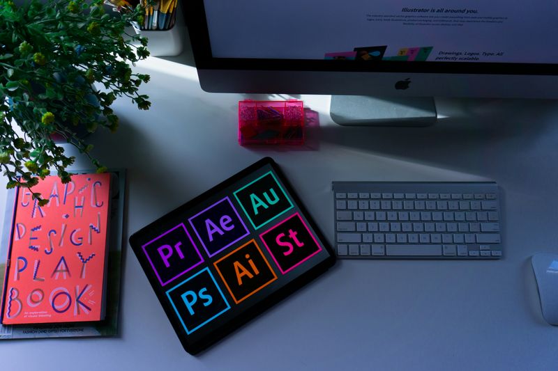 Photo by Emily Bernal on Unsplash
Get creative with tools!
Tools: Use design software like Adobe Illustrator, Photoshop, or Canva.
Templates: If you’re new to design, start with a template. It’s a great way to ensure a professional look. Canva is a user-friendly platform with many predesigned templates for various themes.
Here are links to some useful tools:
Quiz
Which of the following platform is the best to design a poster as a beginner?
Step 7: Finalize and Proofread
 Photo by Dmitry Ratushny on Unsplash
Polish your masterpiece!
Review: Double-check for spelling and grammatical errors and every key information.
Feedback: Show your poster to others and get feedback to ensure clarity and appeal.
Take Action

Your feedback matters to us.
This Byte helped me better understand the topic.
