Ever wonder why some ads just pop and others don't?

Turns out, successful advertisements are about more than eye-catching pictures. The font you choose can make or break a successful brand identity.
Picking the right font can make your ads stand out! 👈
Why Fonts Matter
Typography is like fashion or furniture. With rare functional exceptions, the world doesn't need new clothing or furniture designs, but people want to look different or evoke a particular feeling or fit with a particular look, and there are trends and styles.
— Thomas Phinney, former CEO of FontLab
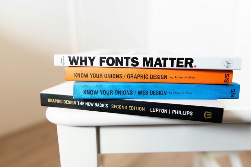 Photo by Jeroen den Otter on Unsplash
Like every choice you make in advertising, your font will impact a potential customer's decision to buy your product.
The font you choose will...
Set the mood and reflect the brand 🎭
Make your messages easy to read 👓
Grab attention 😲
Make your ad stand out from the crowd 🥇
Types of Fonts
Since font choice is such an important part of successful advertisements, you should explore different font families to figure out which one works best.

Serif Fonts
Classic fonts like Times New Roman feature dashes or lines that look like fancy little feet on the letters.
In advertisements, serif fonts are usually used for logos and shorter messages. 👈
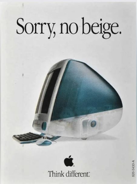 Image courtesy of Ads Library
Sans-Serif Fonts
Fonts like Arial are clean and simple, without the serifs at the ends and edges of the letters.
Sans-serif fonts are great for logos or longer ad copy. 👈
 Image courtesy of Campaigns of the World
Script Fonts
Fonts like Pacifico look like a person's handwriting. They bring a personal, artistic touch, but use them sparingly — they're not the easiest to read.
In advertising, script fonts work best in titles or logos with very little text. 👈
 Photo by Maximilian Bruck on Unsplash
Quiz: Identify the Font Type
Quiz
Which type of font is used in the image above?
Formatting Choices
Choosing your font is just the beginning — you've also got to make the right calls in formatting your text to ensure your advertisement is successful. 🎨
Going Bold
You can use boldface to catch a reader’s attention, but it isn't always the right choice.
Use bold:
For heavy emphasis ✅
To create contrast ✅
Avoid:
Overuse of boldface🚫
Boldface with heavy versions of fonts 🚫
 Image courtesy of Adidas via Advert Gallery
Leaning Toward Italics
Italics can be difficult to read in some sans-serif fonts, so use this formatting style with caution.
Use italics for gentle emphasis ✅
Avoid italicswhen it makes the text less readable 🚫
 Image courtesy of Glorify
Color Choices
Your color choices play a major role in brand recognition.
Using colors can increase brand recognition by 80 percent, and a staggering 85 percent of consumers buy a product because of its color.
— Constant Contact
Stick to 2-3 main colors ✅
Avoid using too many colors — your ad will lose its effect 🚫
 Photo by Mahbod Akhzami on Unsplash
Match the Brand

Your font choices shouldmatch up with the brand you're advertising, like matching up pieces of a puzzle. 🧩

Reflect the Mood
Think about the emotions connected to the brand — is this brand playful and fun, ritzy and glamorous, serious and formal, rustic and homely...? Your font should evoke those emotions. 🧩
Appeal to the Audience
Fonts need to speak to your audience. Know who you’re talking to, and pick fonts that will match their style. 🧩

Converse and Nike are great examples of font-to-brand matching.
These are two brands that sit in the same industry, they appeal to different audiences and have two different stories they want to tell.
— Jamie Chew, Fonts and How They Influence Our Perception of Brands
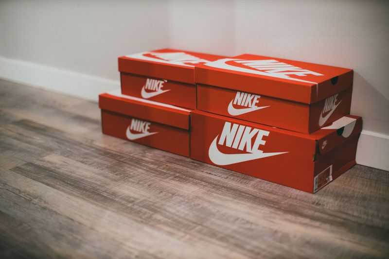 Photo by Jonathan Cooper on Unsplash
The Nike brand is all about "expanding human potential" by creating "innovations in sportswear." Their sans-serif font, are modern, sleek and powerful — exactly how they want customers to view their products. The italic formatting makes the word "feel" fast — like a powerful runner moving forward. Nike's font choices are sharp, bold, and modern, perfectly matching the essence of this brand.
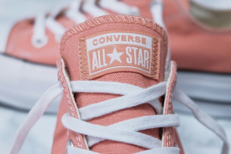 Photo by Glenn Diaz on Unsplash
The Converse brand uses a simple, clean sans-serif font. It doesn't feel as sporty as Nike because this brand has a different audience — one that seeks casual, trendy, creative footwear. The font choice is much more friendly, but still modern, reflecting a brand that is casual, retro, cool, and indie.
Pairing Fonts
Mixing fonts is like putting together an outfit. You want to choose just the right pieces that compliment each other.

Tips for successfully combining fonts:
Use a single font family for simplicity. 👍
Keep itminimalby using simple font combinations. Combine a serif with a sans-serif or a script with a sans-serif to keep the design balanced. 👍
Use contrasting fonts for better visual impact.Serif and sans-serif pairings work well - try pairing a decorative font with a simple sans-serif. 👍
Avoid using similar fonts. Fonts that look too similar will make the design confusing. ✋
Limit the number of fonts and font types (2-3 fonts). One for the headline, one for the main text, and maybe a third for accents. ✋
Notice how this ad combines fonts in a simple, yet effective way to reflect the smooth simplicity of this brand:
 Image courtesy of Design Matters via Canva
Use a reference guide to help you choose the right font combinations — like Canva's Ultimate Guide to Font Combinations. 👈
Quiz
When creating an ad for a cool tech gadget, which font choice best shows it’s innovative?
Take Action

Remember, font choices can make or break an ad!
Choose fonts that are clear, match the brand and effectively communicate what you want your audience to understand about the product or service.
Your feedback matters to us.
This Byte helped me better understand the topic.

